Getting renters and landlords to see both sides
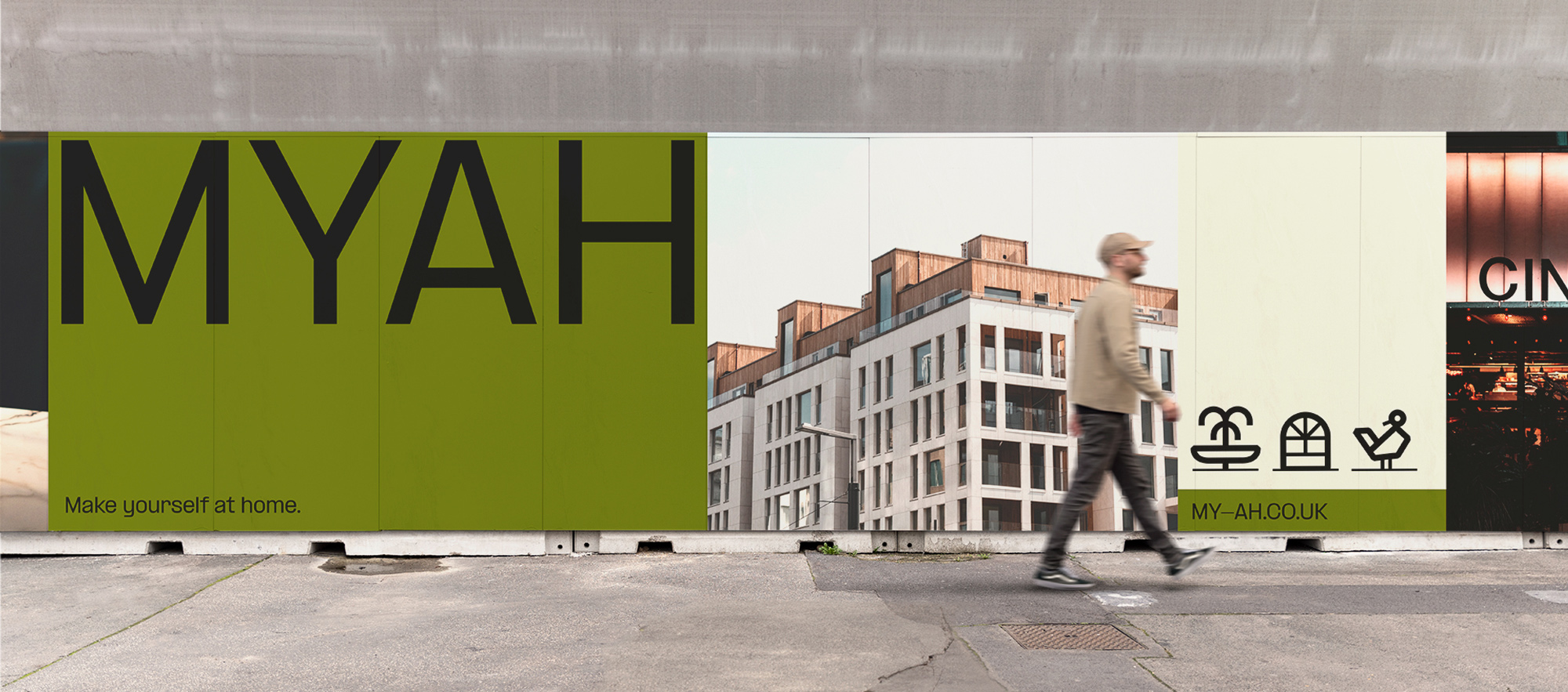
MYAH
Branding
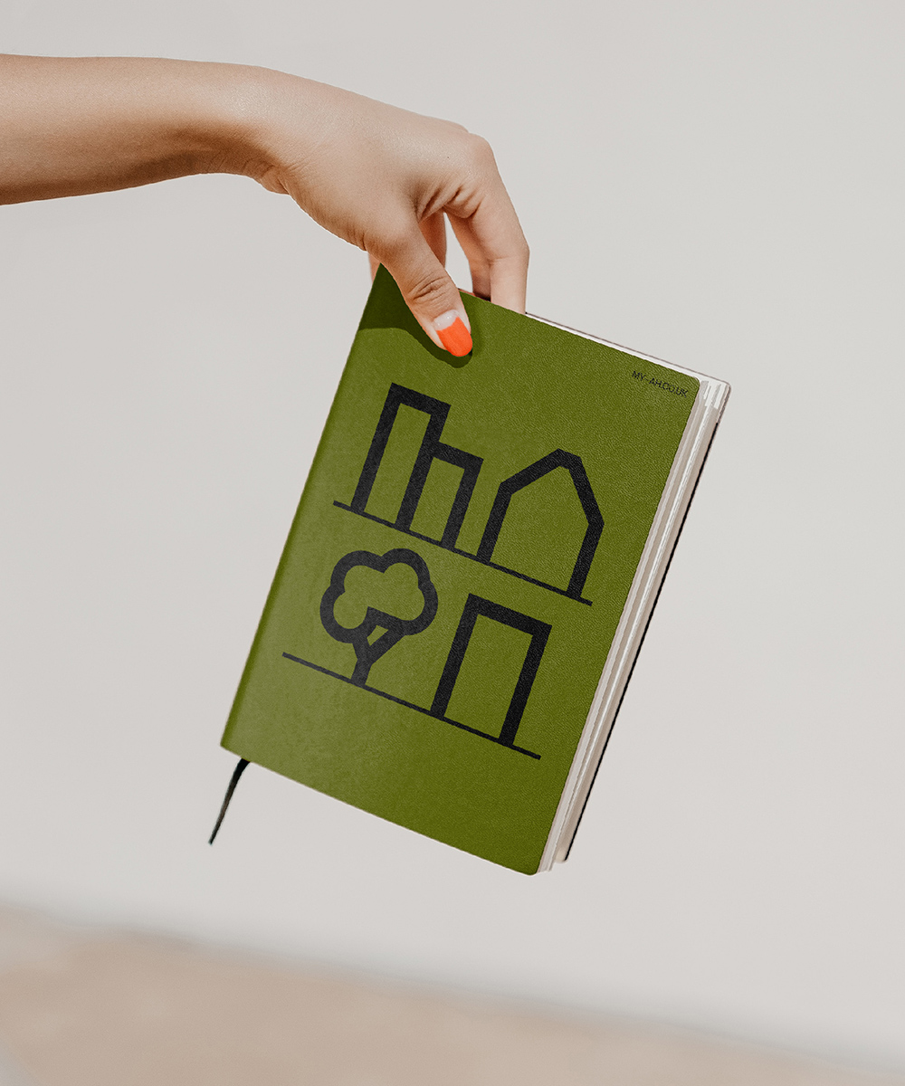
Iconography
Website
Animations
Guidelines
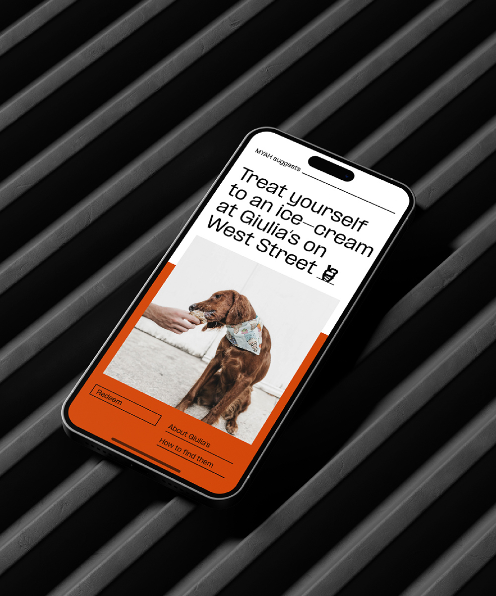
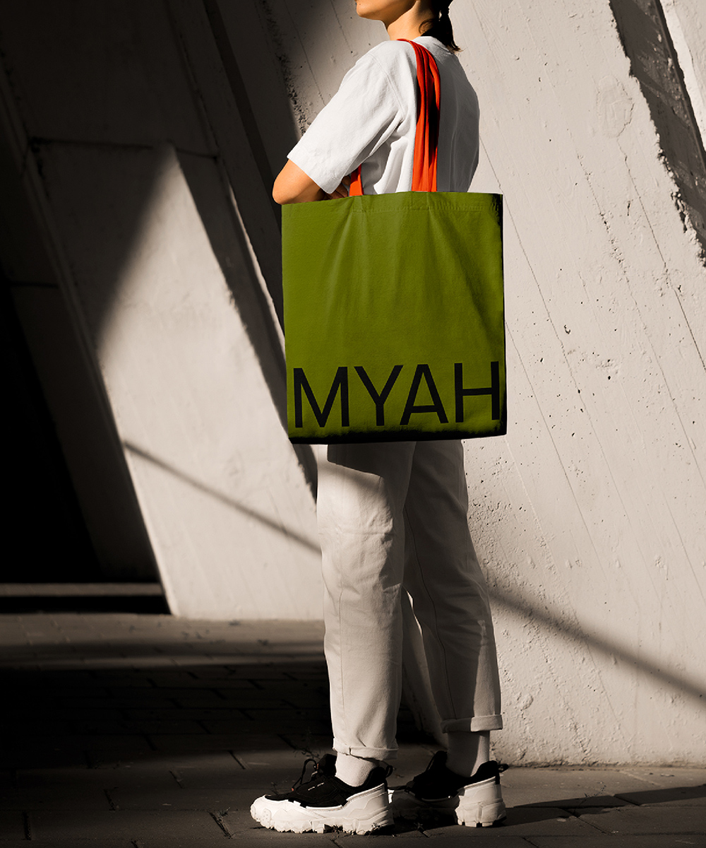
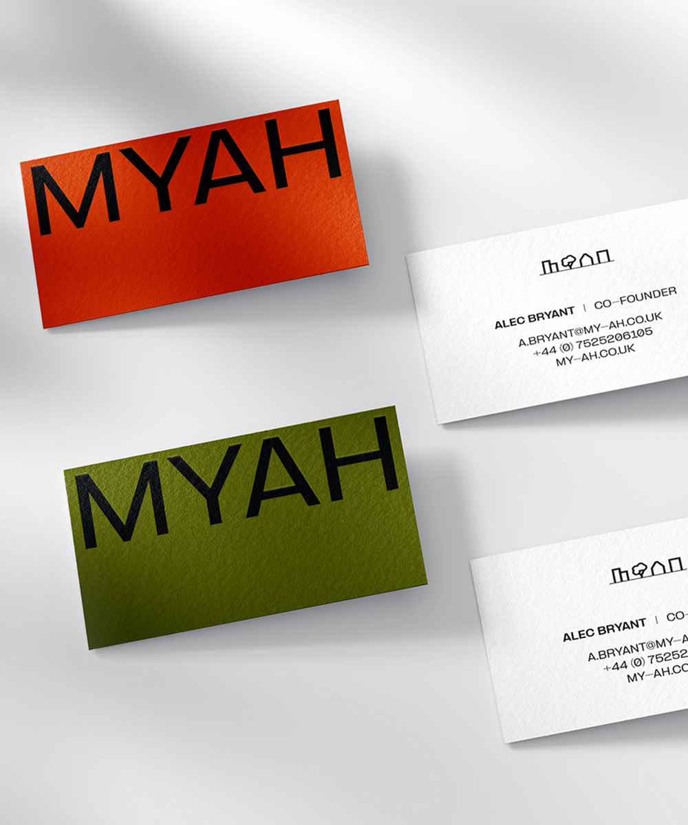
We created a complete brand identity for a property tech company bridging the gap between landlords and residents, from warm visual language to iconography that celebrates community.
Property sites talks efficiency and returns, but tenants want something fundamentally different from their living experience. We worked with MYAH to find something more human: the simple truth that rental should feel like home, not just housing.
The brand became a breath of fresh air. Bright, warm tones that soften an industry obsessed with cold metrics. Icons that capture the eclectic joy of real communities. A typeface that speaks to fund managers and future tenants with equal warmth.
Making rental the first choice, not the last resort. That’s when the industry started listening.